Hello Cambridge people! Today I researched for credit sequences as well as fonts. Me and my team researched various films, but I will narrow it down to three. The three films that I viewed was "Bend It Like Beckham, I, Tonya, and Black Swan". All these films have a focus on emotional connection with the characters, as well as centering their obsession with their sport. Dedication is evident in each movie, adding a unique twist in each film opening.
Bend It Like Beckham (2002) titles roll in a lively, dynamic sequence that mirrors the film's lively mood. While the opening credits are shown in a light and joyful manner, the opening segment opens with Jess secretly practicing soccer. The font selection is contemporary, bold, which fits with the ideas of rejecting convention and going for one's own goals. An upbeat, catchy soundtrack compliments the credits, giving the movie a modern vibe. By emphasizing her youthful and the general, chill tone of the picture, the titles' design contributes to film's tone.

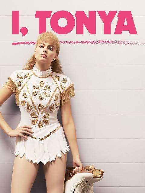
I, Tonya (2017) is another film I researched where her career is surrounded by her figure-skating skills. The film's opening is interviews of people that have been in Tonya's life and as each share their story, credits are displayed on the bottom left corner. The opening credits of I, Tonya are intertwined with the film’s unique narrative structure. They are presented over old footage of Tonya skating, alongside interviews with the characters. The font used is simple and straightforward, mirroring the 1980s and 1990s aesthetic, which connects to the time period of Tonya’s rise to fame in the figure skating world. The use of typewriter-style credits, combined with retro visual elements, gives a nostalgic feel to the film. This clever approach to credits sets the stage for a narrative that examines media portrayal, and different reality to each person.

Black Swan (2010), the credits are introduced in a dark, almost like a dream setting, establishing a psychological tension of the film. The font is sharp, thin, and stylized to evoke a sense of sophistication, fitting for a story set in the world of ballet. Possibly portraying how the character isn't as bold, just fragile obsessed with perfection. The opening credits are presented with of fusion of Nina’s rehearsals and dreams, using slow-motion and surreal visuals that evoke a sense of uneasiness. The music intensifies as each credit appear, adding to the unsettling atmosphere. The use of shadowy, distorted images in the opening sequence reinforces the idea of the pressure she faces to achieve perfection in her role as the Swan Queen. The credits themselves blend into the surreal (almost haunting) visuals of the film, helping to hook and immerse the audience in the psychological world she inhabits.

The font for each of these films is in bold. With a research, I discovered that bold font is typically used to signify directness, that the filmmakers want to draw the viewer's attention to. With the character my group wants to achieve, bold seems like a perfect fit.
Each one of these films will help contribute to my final product for my portfolio! I feel like the more I research, the more information I absorb, the more prepared I feel to making the film opening!


No comments:
Post a Comment